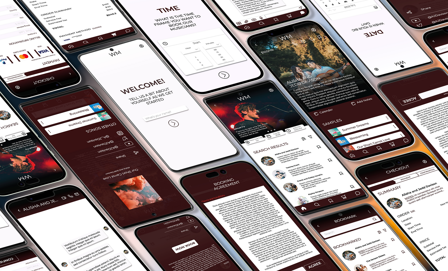
Wedding Musicians
Wedding Musicians is an app that helps customers find and book musicians for their wedding day. It has an intuitive interface that allow users connect with musicians, check their availability, and make bookings, all through the app. This can help users save time and stress when planning their wedding.
Services Offered: WordPress, Figma, Adobe Illustrator, Adobe Photoshop, Microsoft Office
Duration: June 2022 - October 2022
Program: Grow with Google Professional UX Design Certificate Program
Project Summary
The app offers a streamlined platform for couples to:
-
Discover musicians: Easily search and browse musician profiles.
-
In-app connection: Contact to discuss details and book musicians directly within the app.
-
Benefit: Save time and stress while ensuring a secure and reliable service.
-
Secure booking: Book musicians directly within the app for a stress-free experience.
Addressing the common frustrations of finding and booking wedding musicians, the app aims to enhance the wedding planning experience by providing a user-friendly and efficient solution.
My Role
Designer - Design research, competitive research, wireframe, prototype, user research, user experience design, user interface design, Presentation
Target Audience
-
Couples planning their wedding
-
Families planning member's wedding
-
Wedding Planners
Jump To
Phase I: Research
Usability Study
Method: Live prototype testing
Participants:
-
Age range: 25-35 years old
-
Demographics: Diverse in gender, culture, race, and sexual orientation
-
Location: Residents of metropolitan and suburban areas
Tasks:
-
Users searched for and booked a musician as if planning a wedding.
-
Users performed actions based on specific questions.
Usability study aimed to:
-
Evaluate the app's usability for a realistic target audience. (couples planning their wedding)
-
Gather feedback from a diverse group of users. (ensuring inclusivity and broad appeal)
-
Assess user behavior and completion of tasks within the app. (identifying any usability issues)
Personas

User Scenario/Behavior:
Isla and her fiancé, Marlin wants to have their wedding on top of the Tribeca Rooftop in New York City, USA. Both her and her fiancé wishes to support local musicians in NY but because they are not a resident, they have a hard time searching for the artists that caters to their interests.
Isla Emerson, Systems Analyst
User Journey Map
Mapping Isla’s user journey provided better insights on how users normally would navigate through a booking app, specially dedicated for a wedding.
ACTION
INPUT LOCATION/DATE/
TIME
SELECT GENRE
BROWSE MUSICIAN LIST
RESEARVE MUSICIAN
SENT CONTACT INFORMATION
RESERVATION CONFIRMATION
TASK LIST
FEELING
ADJECTIVE
IMPROVEMENT OPPORTUNITIES
Decide Location and schedule of performance
Input location and schedule
Excited by the number of musicians available
Provides search and input bars
Provide visual calendars and time
Decide interested music genre
Experiment with other genre
Overwhelmed with number of genre options
Clickable filtering options
Search bar for genre options
Provide “similar” options
Browse available options
Select to view information on musician
Annoyed with lack of visuals and price
Include images
Include short description about musician
Include contact information
Decide interested musician(s)
“RSVP” musician(s)
Dissatisfied with having to find the “RSVP” information
Provide call-to-action button for “RSVP” at the top of the app
Locate contact information
Email/message musician(s)
Annoyed with having to leave app to contact
Provide direct message within app
Clickable number that redirect user to call
Confirm musician
Sign contact
Happy to have a musician to play for the big day
Provide in-app contact agreement
Provide in-app message center for user to stay in contact with musicians
User Research: Pain Points
Following usability interviews with 5 different participants, several key usability issues were identified within the Wedding Musicians app. (Images are solutions to the issues):
Phase II: Brainstorming
Starting the Design
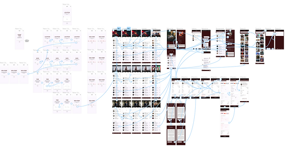
Information Architecture
Based on user needs, an information architecture (IA) was designed to:
-
Guide users efficiently: Easy navigation for completing tasks.
-
Simplify task completion: Streamlined user experience.
Paper Wireframe
Based on the user research and information architecture, here's an approach to quickly sketching design iterations:
1. Identify Key User Flows:
-
Musicians: Searching for gigs, managing profiles, communicating with clients.
-
Clients: Searching for musicians, browsing profiles, initiating communication, booking.
2. Prioritize Key Screens:
-
Musicians: Profile creation, search filters, gig details, messaging interface.
-
Clients: Search results, musician profiles, booking process, messaging interface.

Digital Wireframe - Welcome Page
Wedding Musicians App Navigation Improvement:
-
Welcome Screen: Focuses solely on scheduling options for clarity.
-
"Continue" Button: Enlarged for easier selection.
These changes aim to streamline navigation and enhance the user experience.

Digital Wireframe -
Home Page
-
Reduced clutter: Removed unnecessary elements, focusing solely on clear scheduling options. This simplifies the user's first interaction with the app and directs them towards their primary goal.
-
Enlarged "Continue" button: Increased the size of the button to make it more user-friendly and easier to select. This minimizes frustration and ensures users can seamlessly proceed with their task.
These adjustments aim to streamline navigation and provide a clear and intuitive user experience, facilitating a smooth journey towards finding and booking wedding musicians.

Low-Fidelity Prototype
To refine the app's design, I conducted two usability studies:
Round 1:
-
Users navigated a low-fidelity mockup (basic, low-detail prototype).
-
I guided them to identify essential features and areas for improvement.
Round 2:
-
Users navigated a high-fidelity prototype (more detailed and realistic prototype).
-
No guidance was provided, allowing for independent exploration and identification of additional refinement needs.
This two-phase approach ensured user feedback informed the design process from the initial stages (understanding core needs) to later stages (identifying usability issues in a more realistic setting).

Phase III:
Final Design
Refining the Design
Mockups -
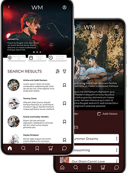
Bookmark Page
Based on the usability study, the musician booking process was improved:
-
Previously: Users had limited options: read their own notes, view the musician's profile, or book directly.
-
Now: A dedicated pop-up screen offers a more focused experience. It combines:
-
Musician information for easy reference.
-
User's notes for quick access.
-
"Book Now" button for clear action.
-
This change aims to streamline the booking process and improve user experience.

Mockups -
Booking Page
Checkout Progress Bar Improvement:
Based on user feedback, the checkout progress bar underwent the following changes:
-
Increased size: Improved visibility for users.
-
Added title: Clarified the bar's purpose.
-
Made clickable: Users can now navigate back to previous checkout steps, enhancing flexibility and control during the booking process.

High-Fidelity Prototype
The final high-fidelity prototype boasts several user-centric enhancements:
-
Larger fonts and action buttons: Enhance user interface clarity and ease of interaction.
-
Clean and organized visual design: Promotes a smooth user flow, facilitating seamless searching, contacting, and booking of wedding musicians.
These changes aim to simplify the user experience and ensure a positive journey for couples planning their wedding music.
Accessibility Consideration
Large text with high contrast for users with vision impairment
Icons and images are used for quick and easy navigation without the over usage of text
Pop-ups and separate pages for certain information creates a for focused experience for users to prevent confusions
Phase IV:
Going Forward
Takeaways
Impact
The Wedding Musicians app provides a quick and easy access for users to navigate through when find a musician to book for their wedding. It takes away so stress when it comes to wedding planning.
What I Learned
While designing the Wedding Musicians app, I learned that it is very important to keep the users in mind. You can try to make the app cool and unique looking but the function needs to be easy to navigate or else it will discourage the users from using the app if it is too complicated to navigate through. Every detail should have a reason for being there, hence why feedbacks are also very important to further understand whether the users are having an easy time navigating through the app or not and if there is anything that needs fixing.
Next Steps
Idea I
Add options for cross-platform edits and cross users edit so different users within the same group can work together when planning. (Being able to add/remove bookmarked musicians, add notes, etc.)
Idea II
Conduct more usability studies for new features such as co-edit within app by different users to determine any new areas of need
Similar Projects

