
green gears mountain bike
A landing page design for a possible business called "Green Gears Mountain Bike". I worked with Figma to create wireframes and mockups for the site. Green Gear is a fabricated business that provides a sustainable solution for bikes and other accessories retail using recycled materials.
Program: Figma
Duration: June 2020 (3 weeks)
Project Summary
Green Gears is a fictional mountain bike retail company focusing on sustainability by utilizing recycled materials in their bikes and accessories.
-
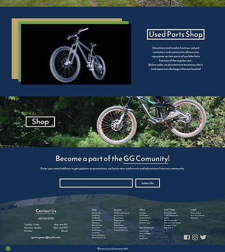
Hero Section: Eye-catching visuals showcasing Green Gears' high-quality, sustainable mountain bikes and accessories.
-
Storytelling: Clear and concise information about Green Gears' mission and philosophy regarding sustainability and responsible manufacturing.
-
Product Highlights: Feature key product offerings with brief descriptions and compelling visuals.
-
Call to Action: Clear prompts guiding users towards desired actions, such as "Explore Products," "Learn More," or "Subscribe for Updates."
-
Modernized & User-friendly Design: Ensure smooth navigation, easy access to information, and a visually appealing experience across all devices.
Subscription Page:
-
This section can offer newsletter sign-ups for product updates, promotions, and brand news, fostering continued customer engagement.
Overall, the Green Gears landing page aims to effectively communicate the brand's values, create a positive user experience, and generate interest in their sustainable mountain bike products.
Project Goals
-
Inform: Educate visitors about Green Gears' commitment to sustainability and recycled materials.
-
Engage: Capture user interest with a visually appealing and informative landing page.
-
Convert: Encourage visitors to learn more, explore product offerings, and potentially subscribe for updates or future sales.
TEAM MEMBERS
-
Conner Coady
-
Becca
-
Anh Ngo
My Role: Co-Designer - Design research, wireframe prototype, user research, user experience design, and user interface design
TARGET AUDIENCE
-
Athletes
-
Bikers
-
Mountain Bikers
JUMP TO
Phase I: Research
WEBSITE RESEARCH
Working as a team, each member does case studies on different business websites with similar target audiences. This allows us to understand the common features that make a good vs. bad website to better brainstorm wireframes and mockups of the design layouts.
Phase II: Brainstorming
STARTING THE DESIGN
Through our understanding of the business, its current website, and its audience, the primary audience is bikers, specifically mountain bikers who are interested in buying and/or renting bicycles and bicycle accessories. With this, our aim is to create a modernized website that provides a space where customers can easily find information on retails and rentals.
PROCESS
Mountain Bike Website: Balancing Content & Commerce
Existing strengths:
-
Nature-inspired color palette (aligns with target audience).
-
Content-rich landing page with clear purchasing options and space for rentals.
Areas for improvement:
-
Streamline purchasing: Consider minimizing clutter by separating rental and retail information (e.g., tabs).
-
Optimize subscription bar: Ensure unobtrusiveness and offer clear value propositions for sign-ups.
-
High-quality visuals: Prioritize professional and user-generated content showcasing bikes and their use.
Additional considerations:
-
Mobile-friendliness: Ensure seamless experience across all devices (mobile-first approach).
-
Search functionality: Implement robust search for easy product and information access.
-
Calls to action: Encourage users to take the next step with clear, concise CTAs (purchase, rent, subscribe).
By refining existing strengths and implementing user-centric improvements, the website will cater effectively to mountain bikers, fostering brand loyalty and driving business growth.

#152F52
#5FA5BF
BUTTON
TYPOGRAPHY
P1
style guide
COLOR PALETTE
#729C44
#46783F
#BBA377
#FFFFFF
LOGOS

ICONS


INPUT
H1
H2
P2
PHOTOS
(Email Header transparency - 50% --- Landing Page Footer transparency - 30%)

LOW-FIDELITY WIREFRAME

I created a low-fidelity prototype that’s based on the Information Architecture to show the user flow when navigating through the app, from searching for a musician to contacting the musician to using the in-app messaging.
Phase III:
Final Design

Similar Projects

